Project Description
Book Logo
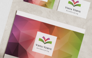
I designed a book logo for Western Slope bookkeeper Vista Verve.
She requested bright ‘jewel’ colors, which I used in gradients to create two nesting ‘V’s for Vista Verve, which also double as ‘books’. The colors and curved design speak to ‘relief from monotonous bookkeeping’ and ‘creative problem solving’. The main emblem can also be interpreted as a flower, which appeals to the female creatives she’d like to have as clients.
The typefaces are Adorn Serif, a textured, but clear, bold typeface that conveys ‘reliability’, and lowercase Raleway– a clean san serif which symbolizes accuracy.
I used Photoshop to add the jewel gradient colors to the tessellated pattern to be used in her branding.
Teresa is so creative, and she nailed it! She simplified all of the branding questions she asked me into one beautiful little visual statement for my business.






Leave A Comment