Project Description
Photography Logo Design
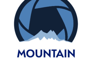
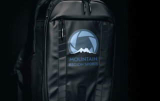
I’ve always wanted to create a logo for a photographer and I had my big break recently with Greg at Mountain Region Sports.
The logo needed to attract the kind of customers my client loves working with–parents of athletes. 🏃🏻♂🏃🏻♀
I used the all caps version of Serenity Demi bold, a clean impactful typeface. The ‘M’ gives a nod to the tops of the mountains, and I made the word ‘Mountain’ the primary focus, since this photographer’s passion lies in mountain sports and attracting the parents of those athletes. I then sized and kerned the ‘Region Sports’ words to match the width of the word ‘Mountain’.
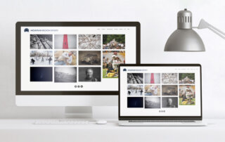
You can find Greg’s logo in action on his website at mountainregionsports.com.
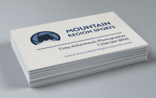
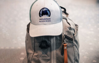
I love that you took my random collection of sample logo ideas and turned them into an expressive logo that works for my website banner, my watermark, and even my business cards. The finished product is perfect for my photography business.


Leave A Comment