


Project Description


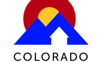


Real Estate Logo
I used Colorado colors to create a symbol that is bold, bright and conveys the notions of leadership, passion and force. It is sharp, clear, highly readable, and presents well with different sizing in multiple and single colors. The house shape at the bottom is also an up arrow, representing increasing wealth through acquisition–and the line in the mountains is also intentionally reminiscent of the rising line in an investment-over-time graph through the gold color. All lines point up! The circular elements soften the logo, cap it off, and are reminiscent of the C and sunshine in our state flag.
The font is a clear, crisp highly-readable typeface (Museo Sans) in a heavier weight so it shows well from a distance.
Exactly what I was looking for! (Yoka Design was) able to capture the idea of wealth generation with relevancy.


Leave A Comment