


Project Description

Raven Logo Design
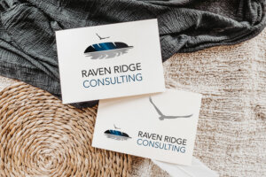
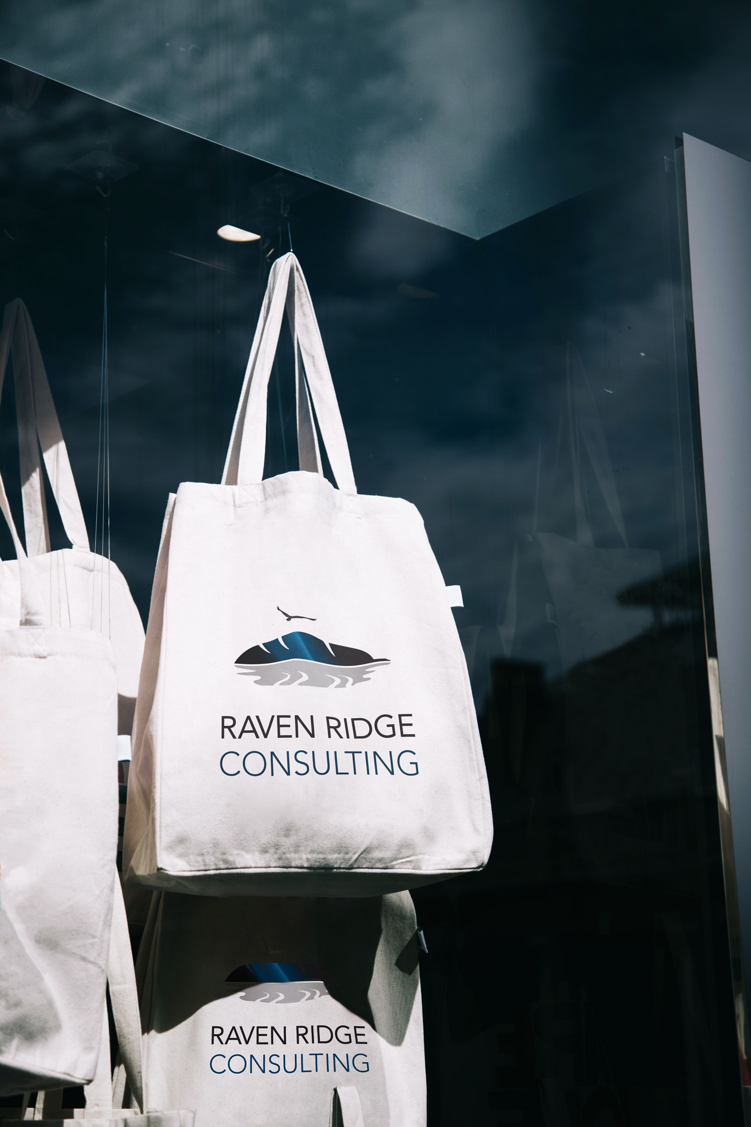
When I began designing the Raven Ridge Consulting brand, I focused on combining natural symbolism with a clean, authoritative aesthetic to resonate with the company’s audience—senior-level decision-makers in large-scale industrial sectors. My client chose the raven not only for its intelligence and watchful presence, but also for the metaphor of strategic elevation—soaring above challenges. The feather doubles as a ridge, and its reflection subtly suggests water, speaking to the environmental focus of her consulting firm. The symmetry of the design adds to its balance, while the simplified form keeps it versatile for all intended applications.
Color was essential to establishing the right tone. The deep black of the feather communicates seriousness, authority, and reliability—important traits for earning trust in a high-stakes, advisory role. The rich blue gradients layered within suggest depth of knowledge and calm control, while blue’s psychology also reinforces trust, professionalism, and high value. These cool, grounded tones were chosen not only to represent the iridescence of a raven’s feathers, but to visually reinforce Raven Ridge Consulting’s position as a strategic, indispensable partner in complex regulatory and permitting landscapes.
For the typography, I selected an all-caps heavier sans serif for “RAVEN RIDGE” to evoke tradition, experience, and stability—appealing qualities to clients who are likely seasoned industry veterans. The word “CONSULTING” is rendered in a a lighter version of the same modern sans serif with subtle letter spacing.
The overall identity was designed to feel strong, streamlined, and quietly confident—exactly the qualities her clientele seeks in a trusted advisor.
Leave A Comment