


Project Description

Dance Logo
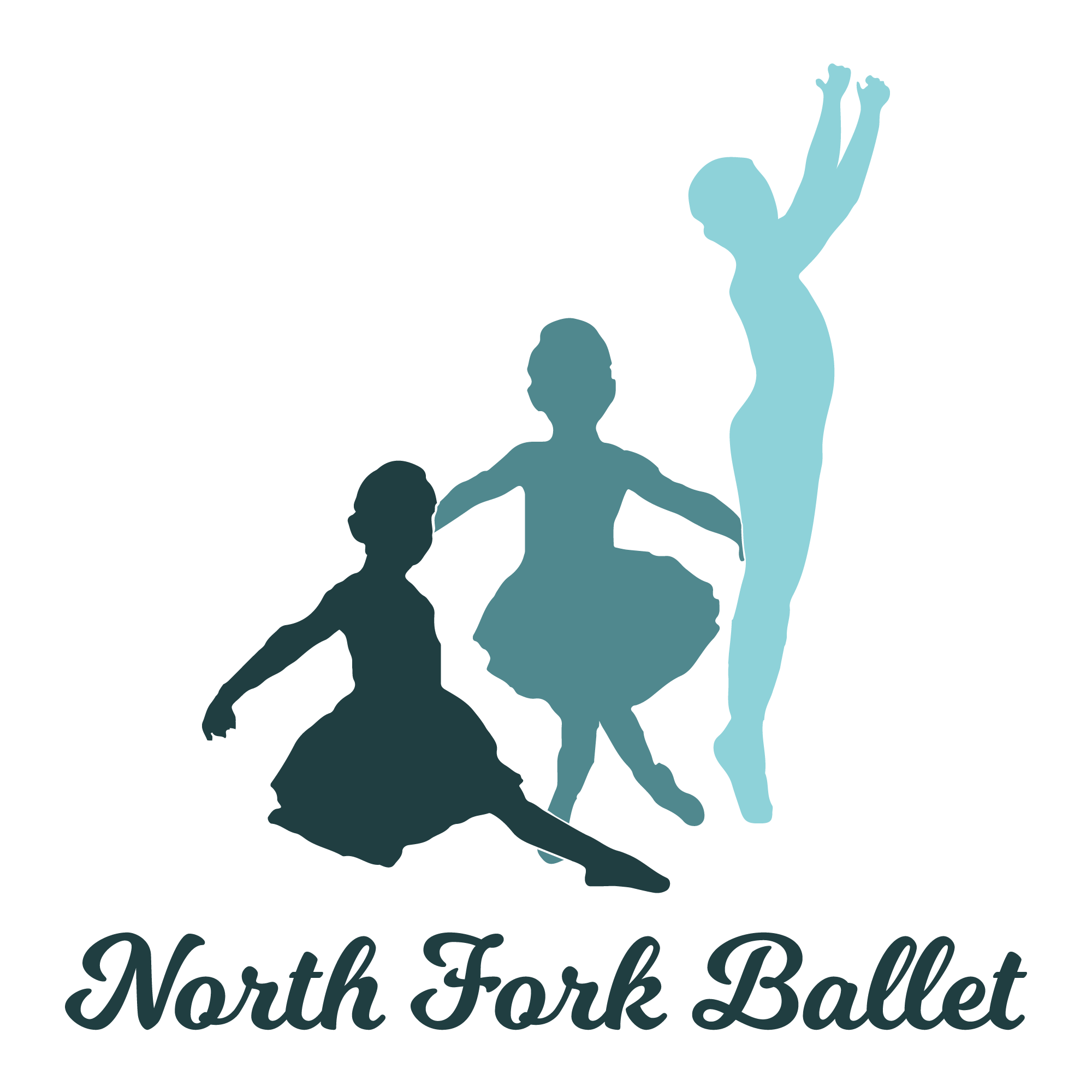
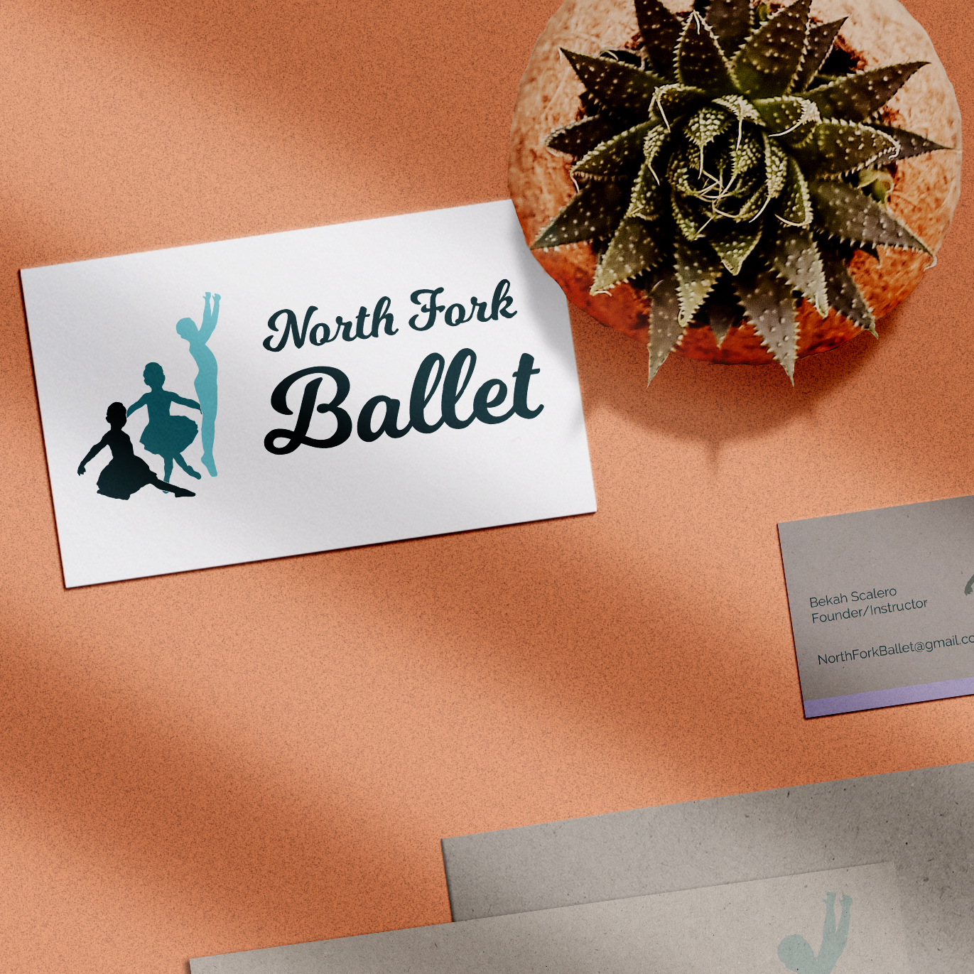
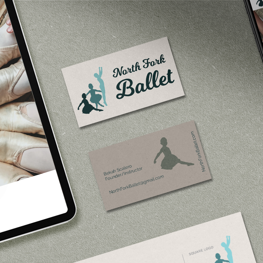
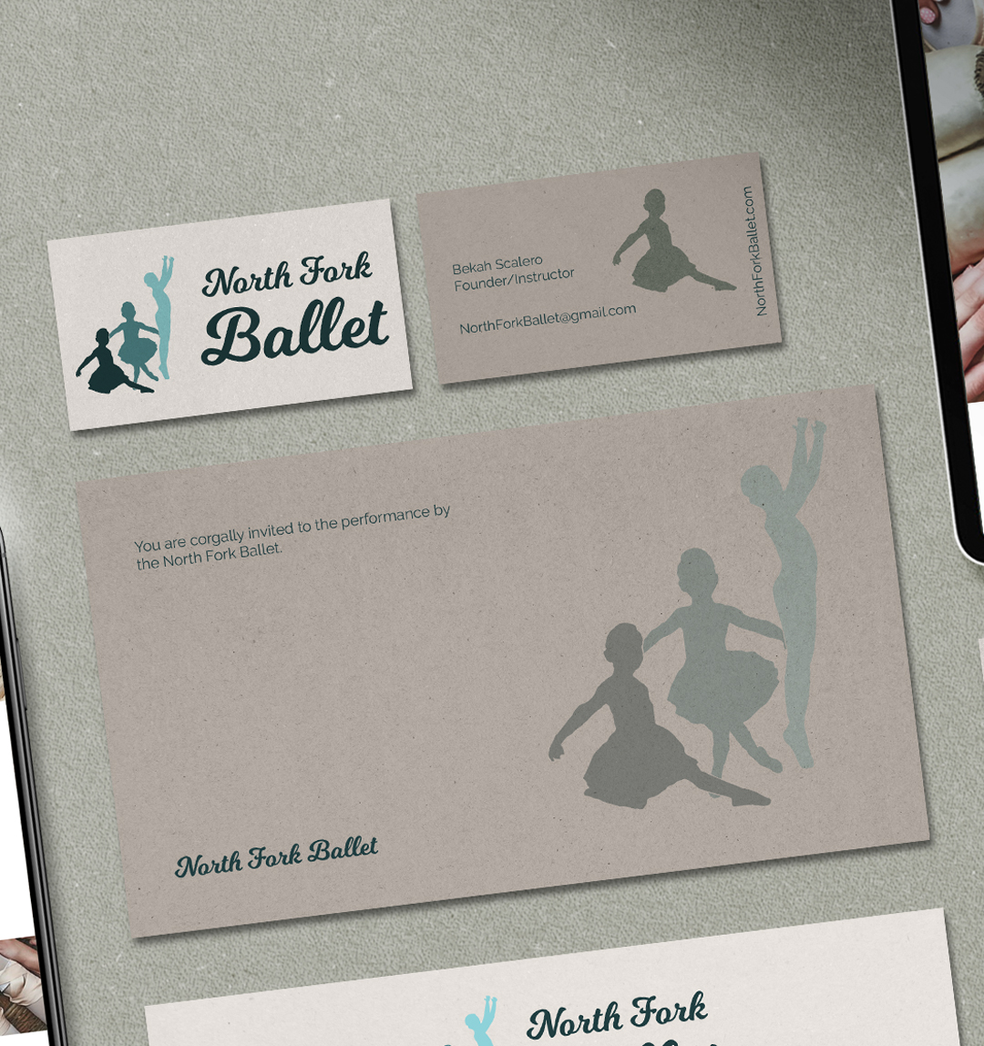
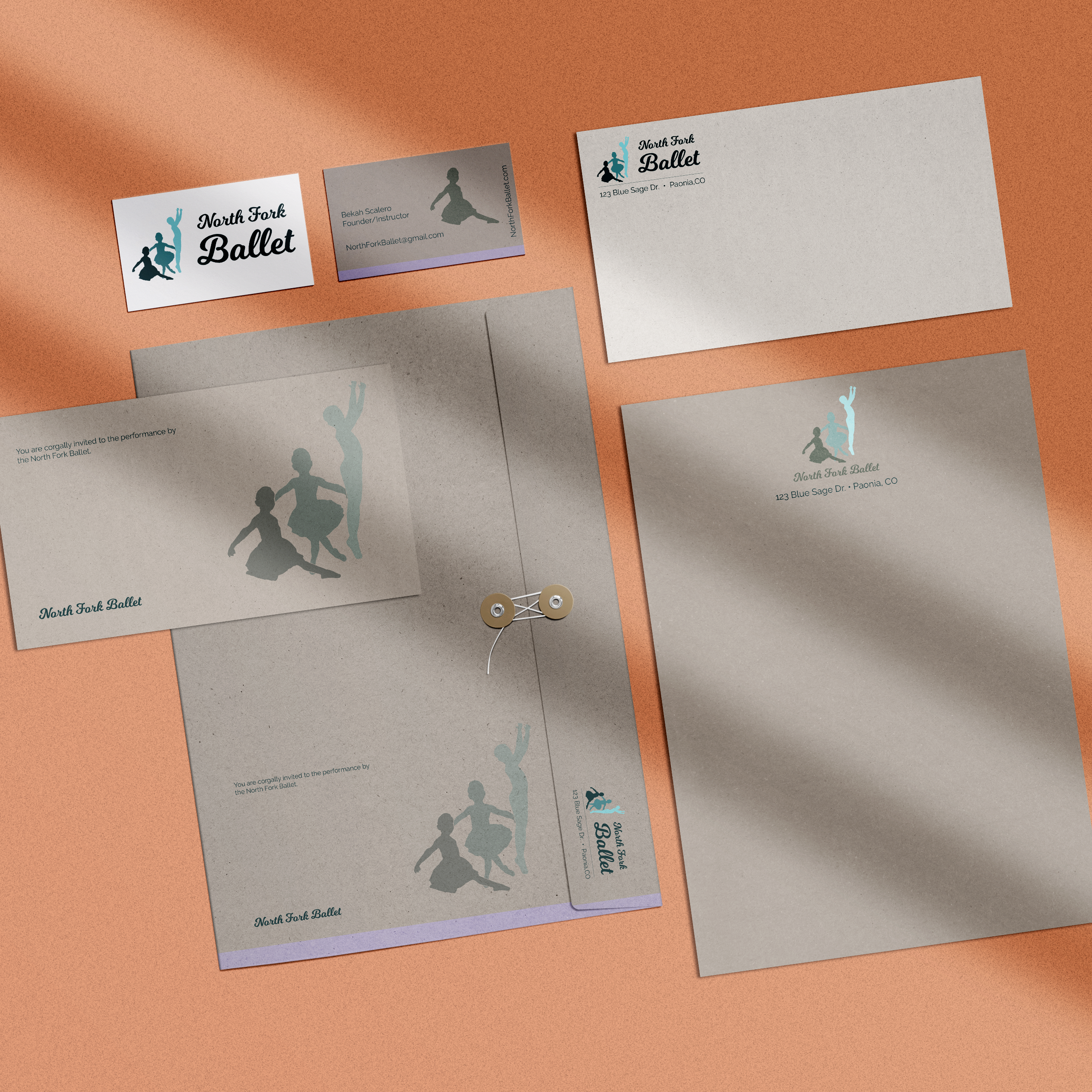
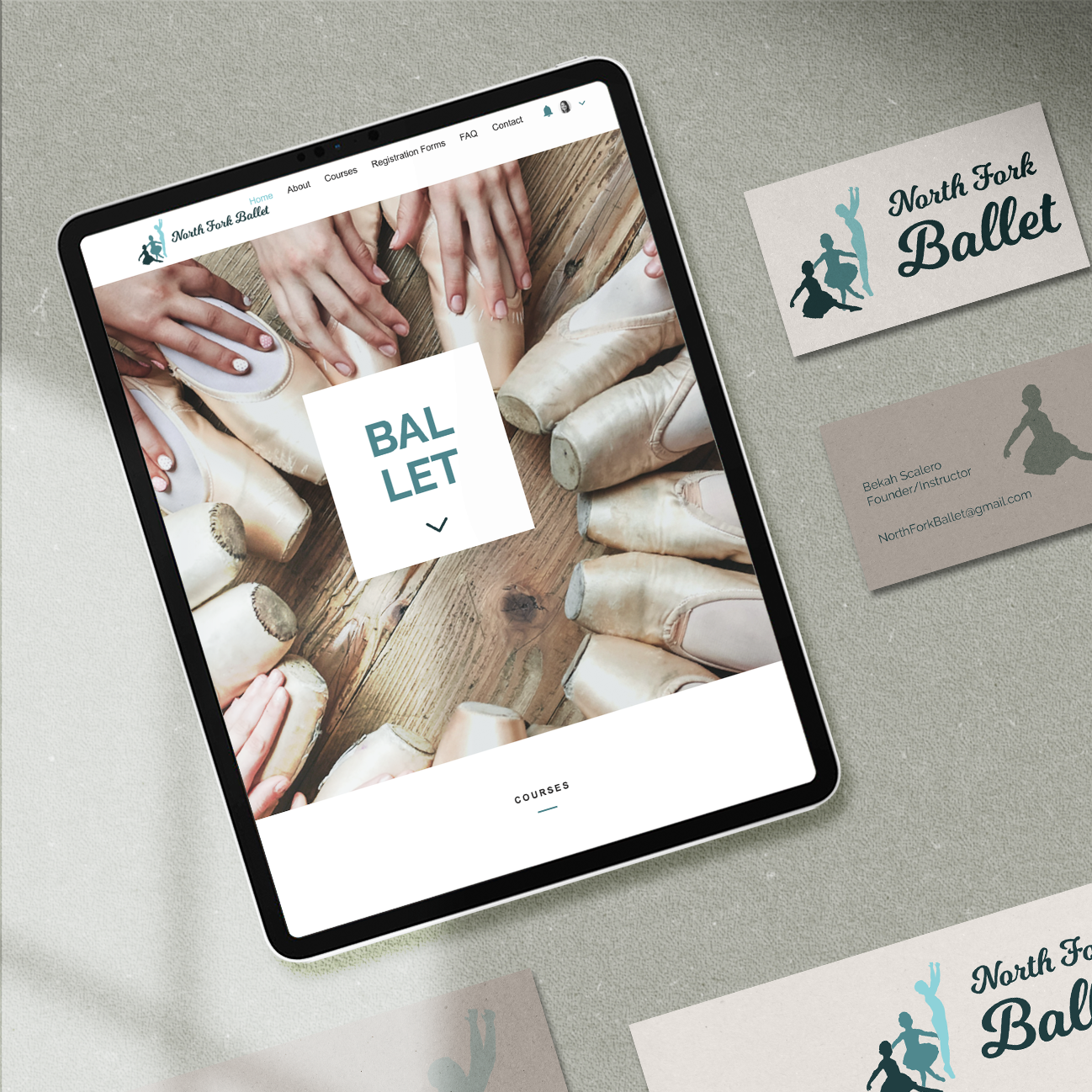
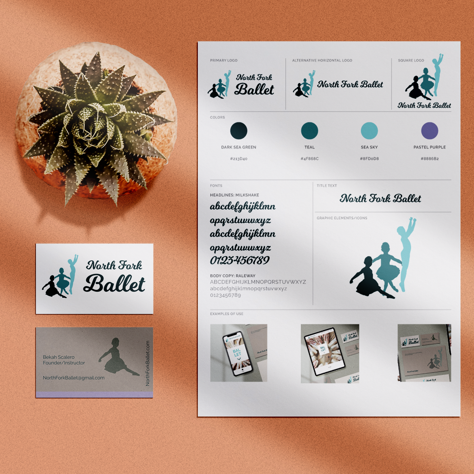
A new logo for the North Fork Ballet school is making its debut! I loved this one…⠀
I worked with Bekah, who wanted silhouettes of kids and an elegant font that was highly legible. And she didn’t want to use the stereotypical ballet pink, which made it even more fun. This is a ballet-specific school serving the rural communities of western Colorado.
I had a vision of the figures telling a visual ‘story’ of improving their dance skills through the motion of the piece. The darker, lower figure gives weight to the series of kids as they progress from a deep teal to a mid-tone and then light turquoise reaching for their full potential on tip toes.
We also used both girls and boys- even though most of her students are girls, there are some boys and they are invited and encouraged to learn this classic dance form.
Learn more about this dance school at NorthForkBallet.com.


Leave A Comment