Project Description
Logo for Bluegrass Music
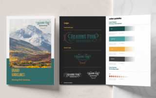
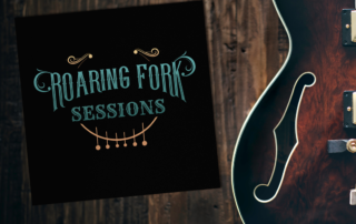
Ed got in touch with me about creating his brand for Roaring Fork Sessions (RFS) and he provided a smattering of visuals to help guide the process. We chose vibrant colors to stand out on both white and black backgrounds. I used the feel of some western fonts provided by Ed, but landed on the Young Heart typeface with some western-style ‘waves’ as a nod to the Roaring Fork River.
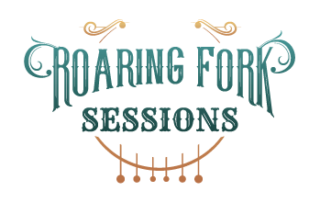
A thin crescent icon hints at a moon to conjure the atmosphere of a show, or ‘a moment in time for a relaxing sanctuary’. The crescent doubles as the soundhole of a guitar with more celestial dots to indicate the bridge (an instrument likely to be included in music presented by RFS). The horizontal version goes so far as to extend the strings and brings cohesiveness and balance to this version.
Working with Yoka Design was one of the best design experiences I’ve had in the last eight years. When a designer listens and provokes creatives ideas to assist, you keep them around.





Leave A Comment