Project Description
Custom Van Brand
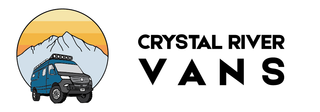
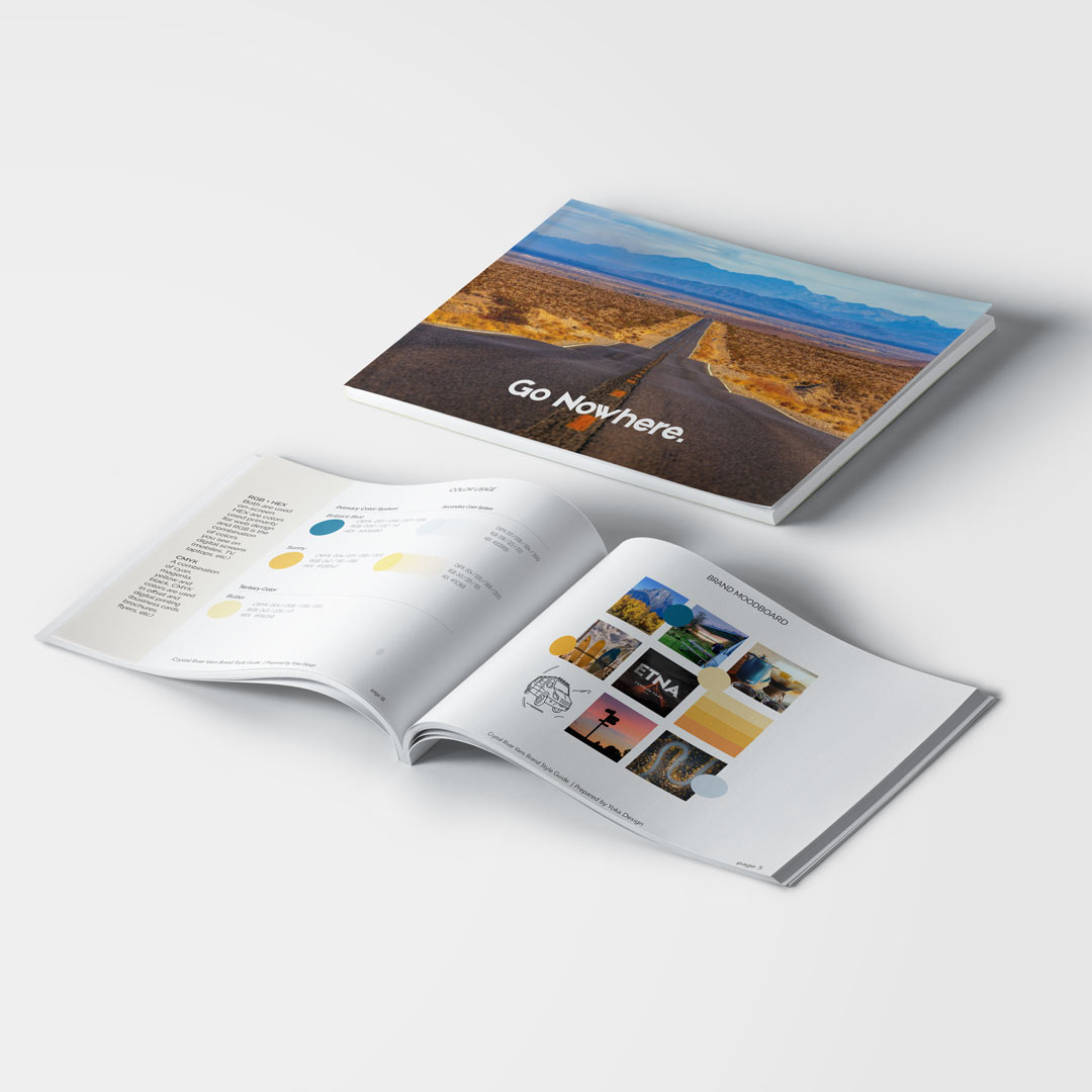
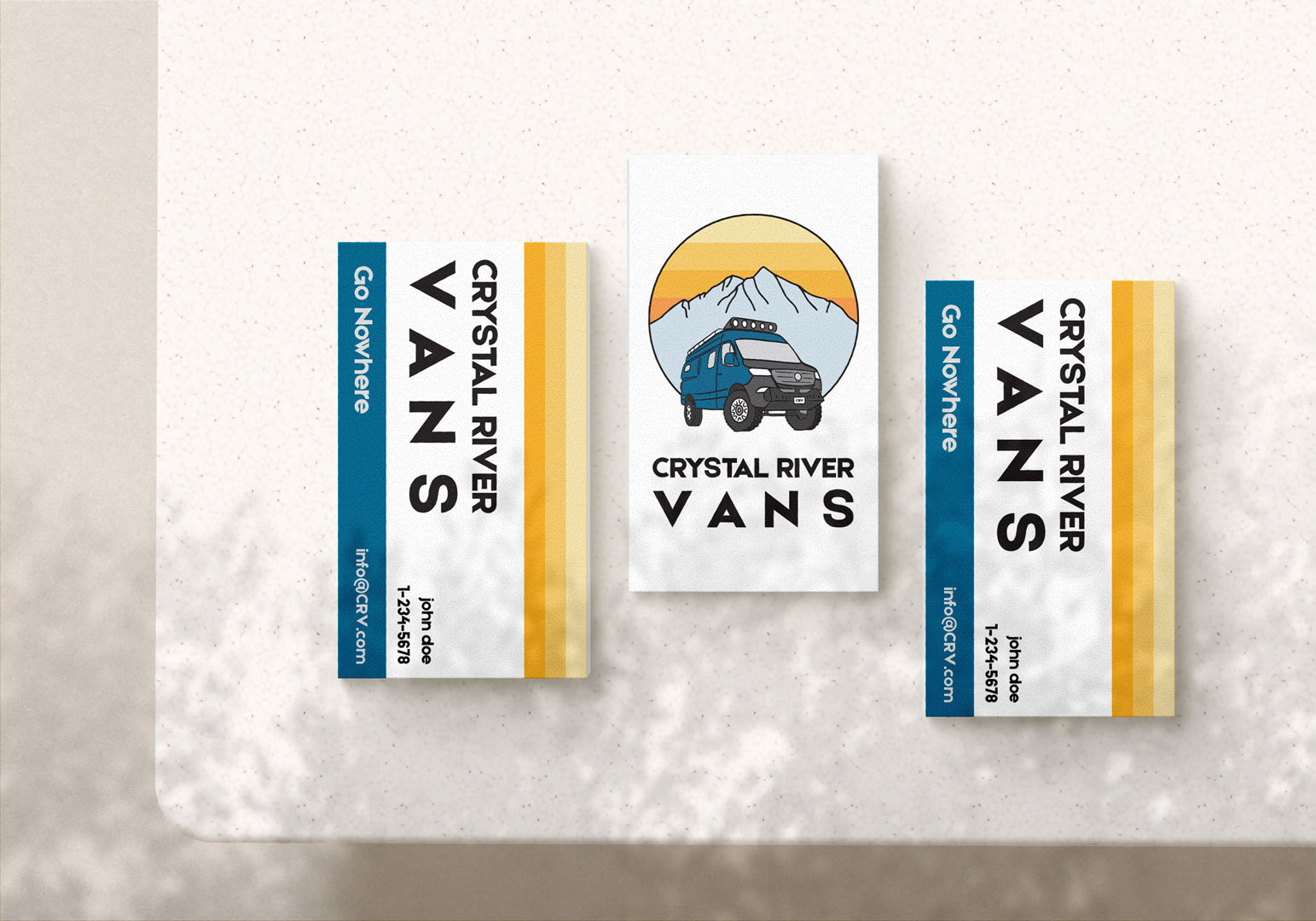
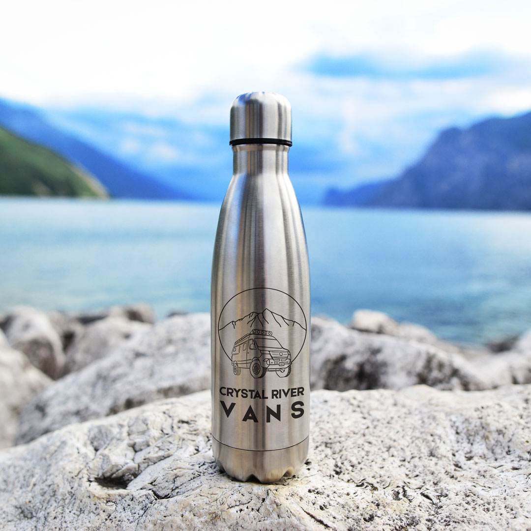
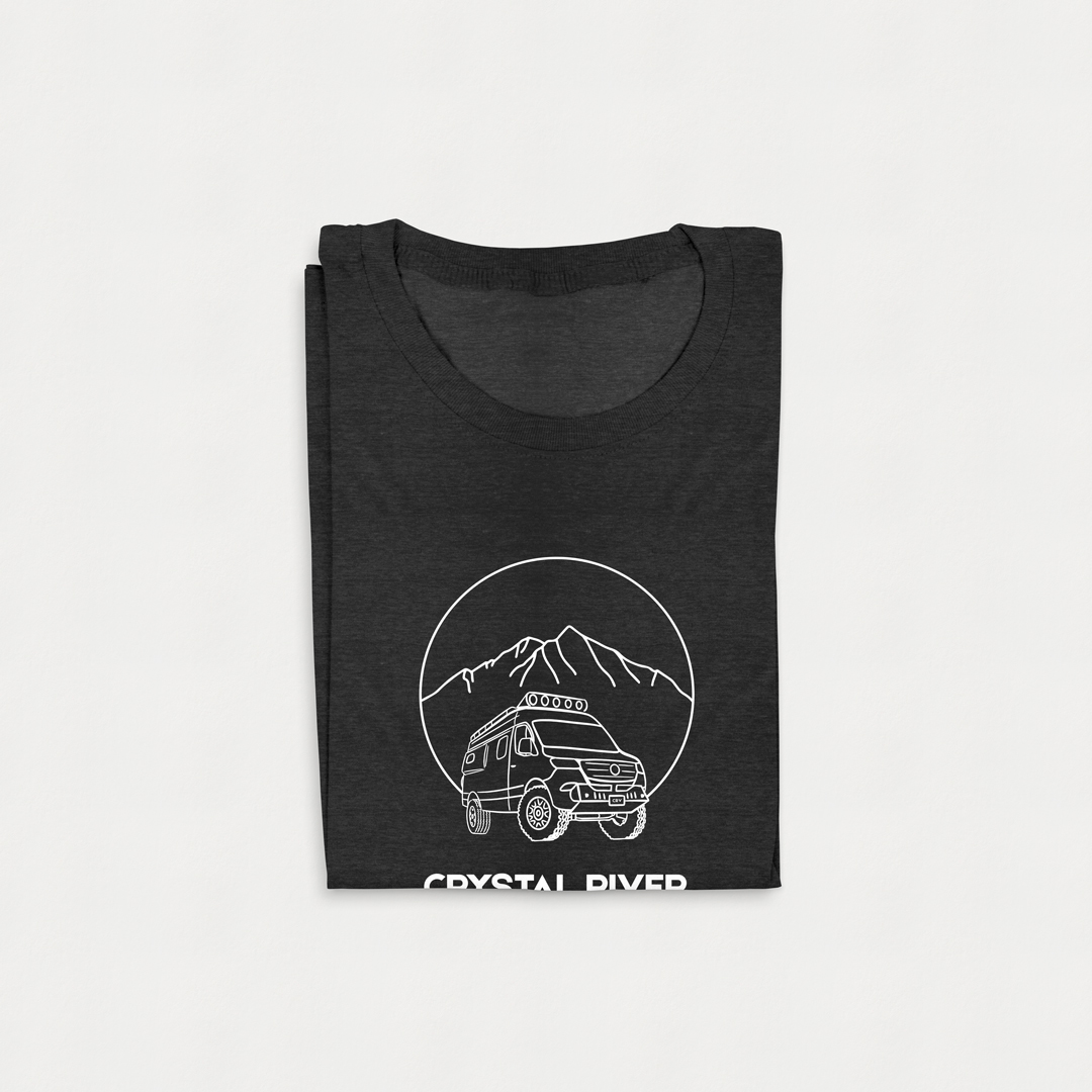
This logo is for a crew that makes custom high-end vans for those who like to ‘geek out’ on all of the possible features. They had a logo they weren’t satisfied with, so I reworked it to show the local mountain skyline and styled it to draw the audience they are seeking. They wanted to convey limitless possibility, that you have everything you need in the van, and that you can go anywhere (presented in visuals as ‘the middle of nowhere’).
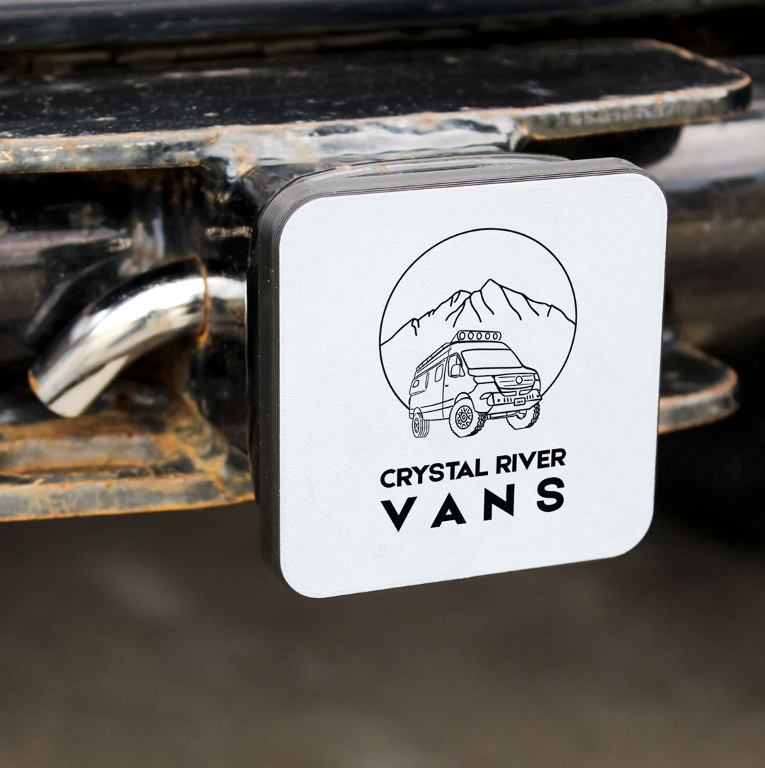
I redrew the van because I feel that it is important to show all the possible customization in a way that appeals to their male target audience. I added the light bar, the pop-out window and more aggressive tires at an angle that shows action. I included Mount Sopris in the background with all of its avalanche paths. I was going to add the river, but it really complicated the design and I wanted to keep the brand simple.
They wanted an interesting font that was simple but not plain, and not overly stylized. I used Etna Sans Serif, a strong, bold font with clean lines and crisp points that will be visible from a distance and speaks well to a male audience.
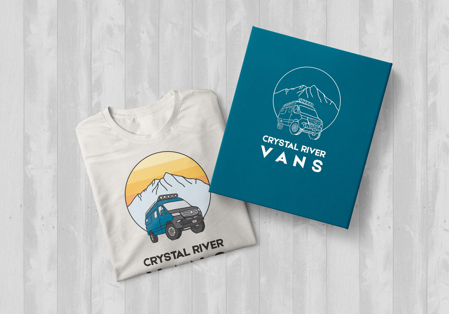
The first design is a line drawing for etching into a trailer hitch or other simplified applications. For the second version I added color, including the blue of their original van, a ‘crystal blue’ for Sopris, and yellows in the sky for a sunset that lends contrast and retro style.

Before

After


Leave A Comment