Project Description
Concert Series Poster
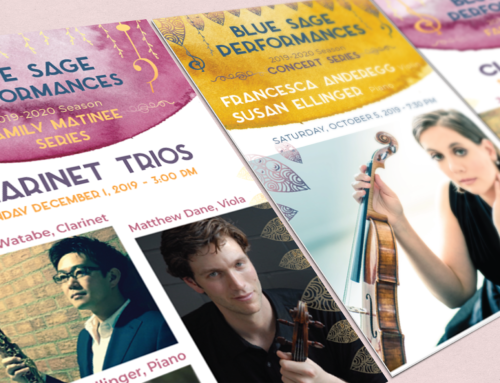
I’ve always admired an artful concert series poster, and I was thrilled when the Blue Sage Center chose my bid to design their posters and promotional materials this year. They wanted an elegant, classic look (no hand-drawing in this one!).
I’ve been experimenting with linocut and the effects you can create in Adobe Illustrator. I created sweeping lacy lines by blending the outlines of musical notes and enlarging and tilting them on the layout with one more twist: the lines are dotted. This creates an almost ‘lacy’ look that conveys the sense of ‘rich community fabric’ the Blue Sage was looking for.



Leave A Comment